Tribe by supertri
A mass participation fitness, wellbeing and training platform.
The initial mission statement for Tribe (originally called 'PQ') was to be a platform promoting wellbeing and an active lifestyle within corporate organisations.
Any comments will be shown here.
Colleagues could create teams and record physical activites which would be converted into Tribe Points. These points are tracked and celebrated across various leaderboards, with the top individuals and teams being invited to a physical corporate experience. With a focus on inclusivity, Tribe allows everyone taking part to compete on a level playing field; no matter your fitness level, Tribe is designed to be engaging and rewarding.
Following the release of the first version, Tribe was expanded to act as a training and community platform which sat alongside a physical mass-participation event, such as the Malibu Triathlon.
The web-application is a technically involved platform, with multiple systems working in harmony allowing users to connect their preferred tracking devices (Garmin, Strava, etc.) and provide a seamless experience across desktop and mobile.
Research & planning
In order to gauge the interest and discover the potential market for the platform a number of discussions took place with corporate organisations of varying sizes.
Whilst the core of the conversations were structured around a questionnaire, it was vital the discussion was kept open and conversational to ensure the true underlying problems and needs of the companies could be discovered. Techniques such as 'The 5 Whys' were used to help determine what the real problems related to employee wellbeing were/are.
These sessions happened remotely on Zoom/Google Meet with a handful of companies around the globe.
The insights of these conversations were then organised into categories such as problems, existing solutions and success metrics which could be used to define what success would mean for this project.
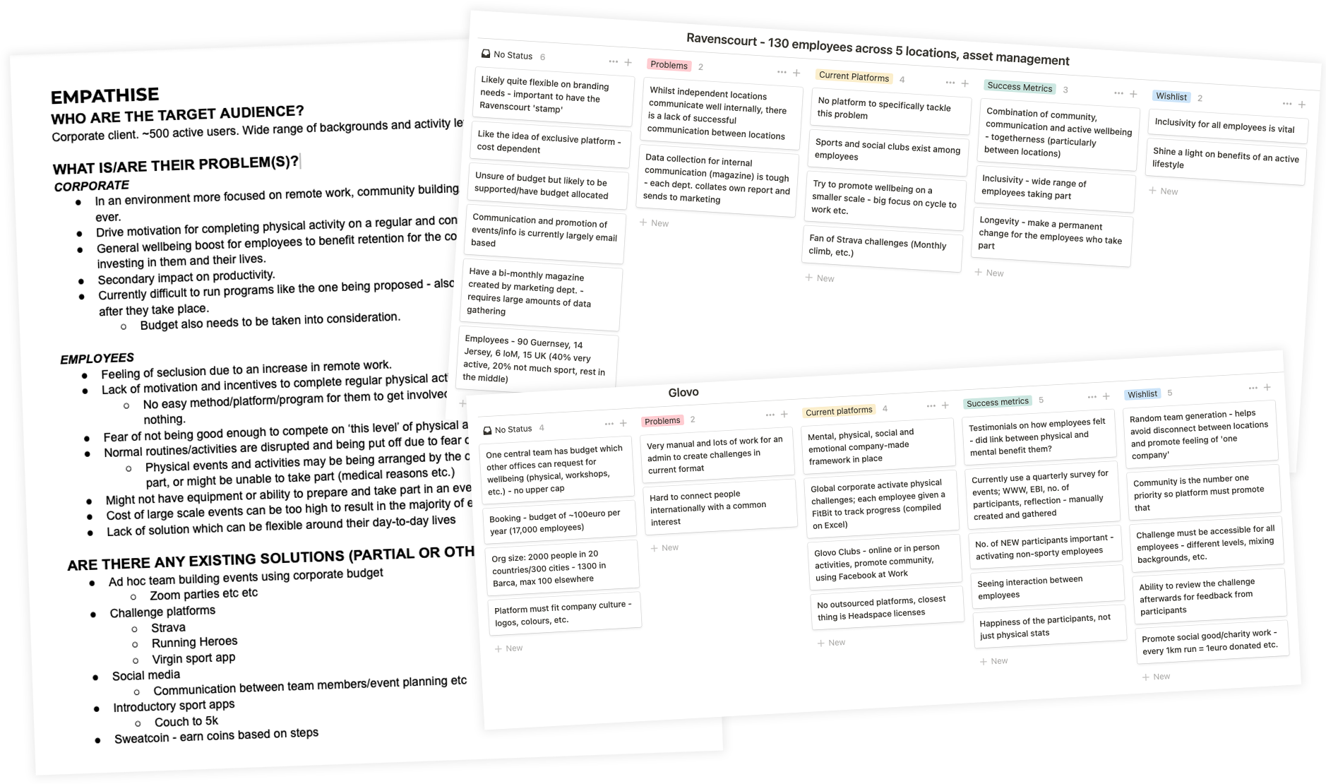
Some of the planning documents following the research sessions.
As always it was really exciting and invaluable to speak with the potential audience and really start to understand the environment of both the problem and the potential solutions.
Using the information gleamed from the research sessions I compiled a list of requirements and organised/prioritised them using the MoSCoW method.
Following the scoping out of the requirements and refinement discussions with the various team stakeholders (project management, devlopers, etc.) I proceeded to translate the requirements into user stories; guaranteeing that the end users were at the focus of our development sprints.
- As an employee, I want my activities to sync automatically so they can contribute to my totals.
- As an employee, I want to be able to interact with my colleagues' activities so I can show support.
- As an admin, I want to be able to invite employees via their company emails so they can sign up to the game.
- As an admin, I want to be able to view an analytics report so I can understand how my employees are engaging with the game.
A handful of the user stories.
Alongside the user stories a number of other design and planning artefacts were created to ensure the project stayed on track and produced a desired end-product - user personas were created, epics defined the core functionality, site-maps built the platform foundations and competitive analysis helped understand the market.
Wireframing
With the planning and initial research completed, I began creating some low-fidelity wireframes.
The wireframes were built in Adobe XD and also functioned as basic prototypes so we could begin testing user journeys and the confirm the architecture/structure of what was to be quite a complex platform.
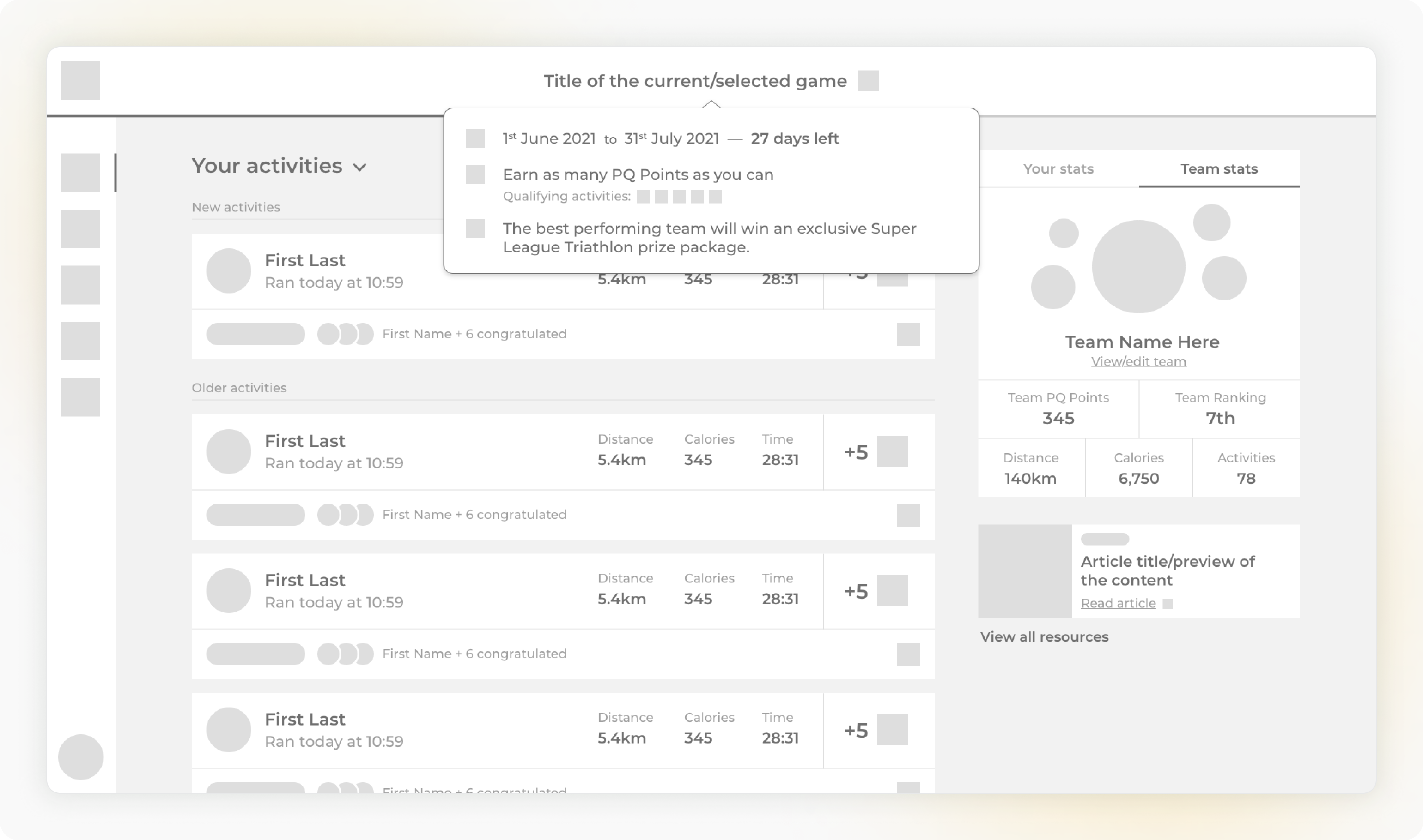
A wireframe of the main activity feed.
Wireframes were completed and tested for each of the main sections and components of the PQ platform.
High-Fidelity Mock Ups
Once the wireframes were confirmed to meet to goals of the project and that the basic layout and structure was effective, I then refined the designs and created some higher-fidelity mock ups so we could understand how the end product would look.
A hi-fi mock up of the activity feed from above.
I have included a broader collection of the final and most-recent (aka better!) designs at the end of this project.
Building
I was also the front-end developer for this project and was responsible for taking the designs out of Figma and into a fully-functioning product, alongside the two back-end developers in the team.
We worked with an Agile methodology with the user stories/epics as a basis for sprints. This meant that progress was always visible and changes were being tested right from the beginning of the development period; the platform was used and tested internally until the first release.
I built the front-end of the platform using React and Sass.
A benefit of both this (and the fact I was the designer and developer on this project) was that as problems or potential improvements came clear I could easily refactor designs to account for them. The end result of this was a platform that was highly tailored to the needs of the users whilst retaining the ability to scale in the future. As would be very important...
v2 & the birth of Tribe
The delivery of the PQ platform in 2022 was widely regarded as a great success. Feedback from the initial users was positive and any issues were taken onboard to help shape the future of the project.
The next iteration of the platform would include a new brand identity - Tribe - which required a visual refresh of the entire design language and numerous new features to further improve the user experience.
Tribe would also make the transition from being a corporate offering to one which supported the physical events that supertri (formerly Super League Triathlon) offered. Both the corporate partners of an event, such as Malibu Triathlon, and the general participants could opt-in to Tribe and benefit from a competitive community platform which ran for the three months before the in-person event.
The north star for this version was to create a platform that would help participants remain focused, consistent and engaged with their training.
Two of the biggest feedback points from v1 were:
"It's hard to climb back up leaderboards and compete if you slip up towards the start of the game, which in turn makes it less motivating to continue."
"I really enjoyed competing and engaging with the other players, and wish we could do even more to help motivate each other."
As we began work on version 2 I went back to the designs with a focus on ensuring engagement lasted for the whole game and enhanced interaction and competition between participants.
First off, rounds were introduced:
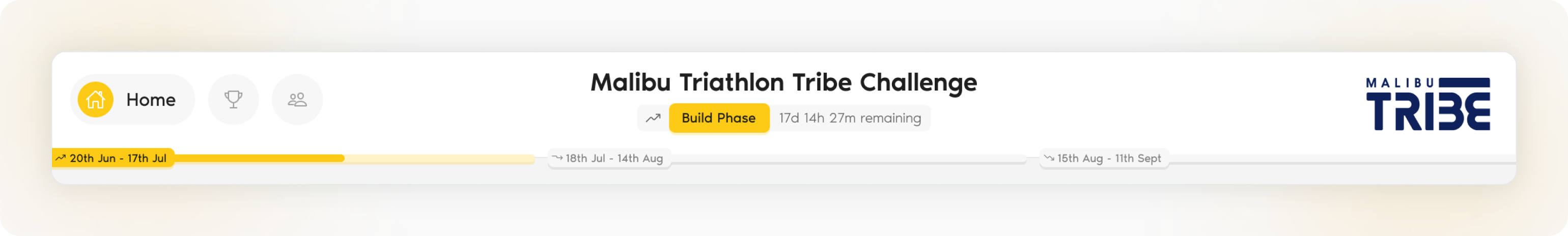
The new nav bar with rounds overview.
Rounds would aid engagement and maintain motivation throughout the duration of games. Through the feedback it was clear it was important to provide a motive to both ensure players had reason to keep up their active lifestyle and also new players could join the game at any time and have a chance to compete at the top. The introduction of rounds helps solve this problem by distinctly separating games into smaller blocks, each with their own competitive leaderboards.
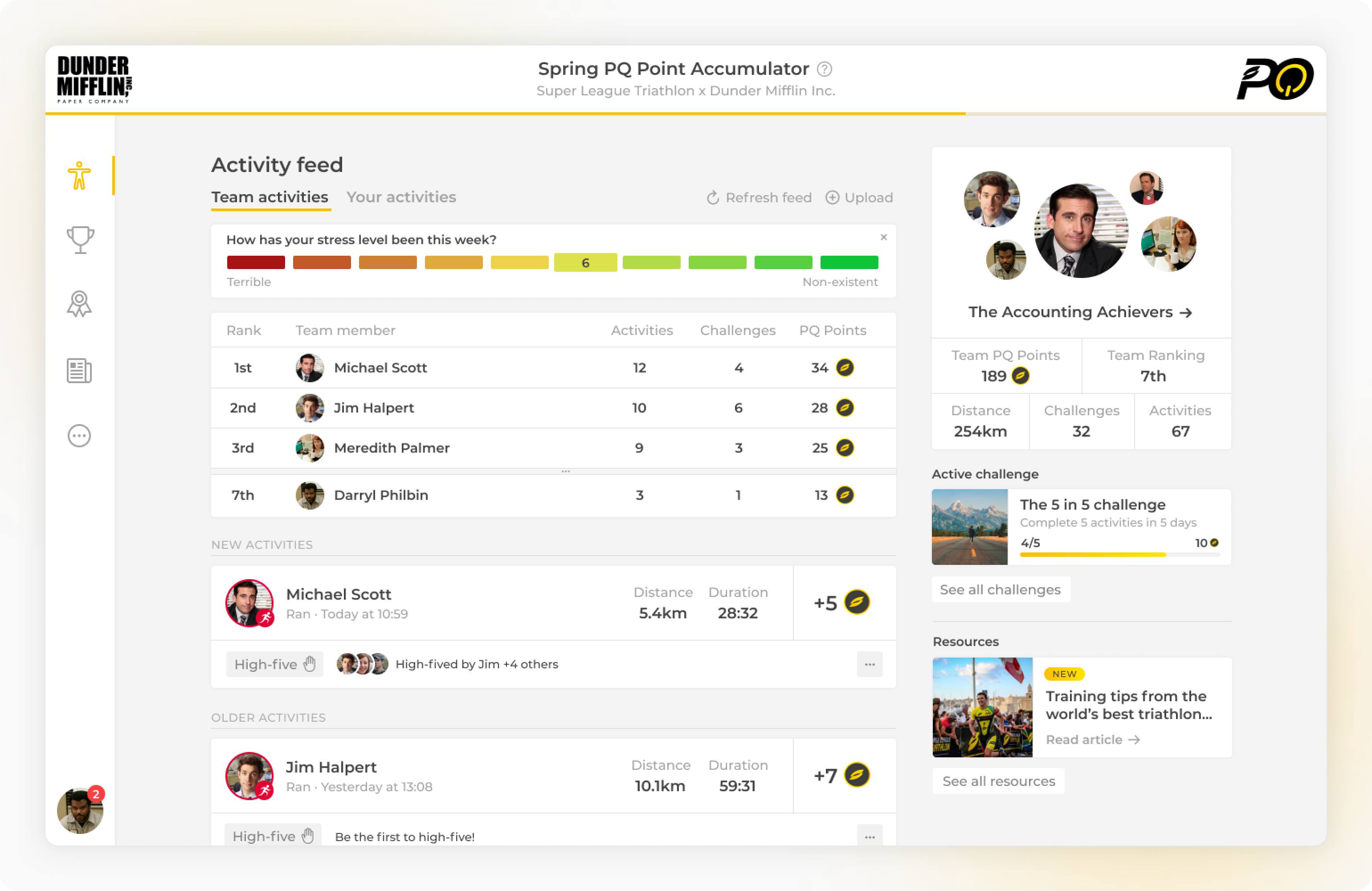
Next, we added far richer activity cards:
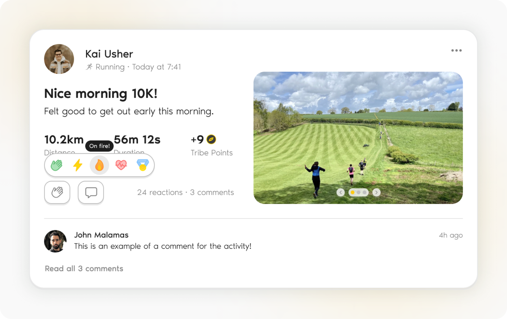
An example of a new-and-improved activity card.
There were a number of new features and goals for the activity card redesign, but the main motivation was improved engagement.
- More expressive reactions. Building on the 'high-five' action from the first version of PQ, users can now choose how they want to react to better express their feelings towards an activity.
- Comments. Users can now spark conversations with profile tagging, offer words of encouragement, and generally share their thoughts on an activity.
- Activity copy and images. The uploader of an activity can choose to add a title and description, and include one or more images to better tell the story of their activity and engage with the community.
The same interactions are also added to the completed challenge cards which show up in the feed, prompting users to engage more with the athletes both in and out of their teams.
To boost the competitive nature of the platform, for those who wanted it, we overhauled the challenges section and introduced a totally new way of competing - ranked Duels.
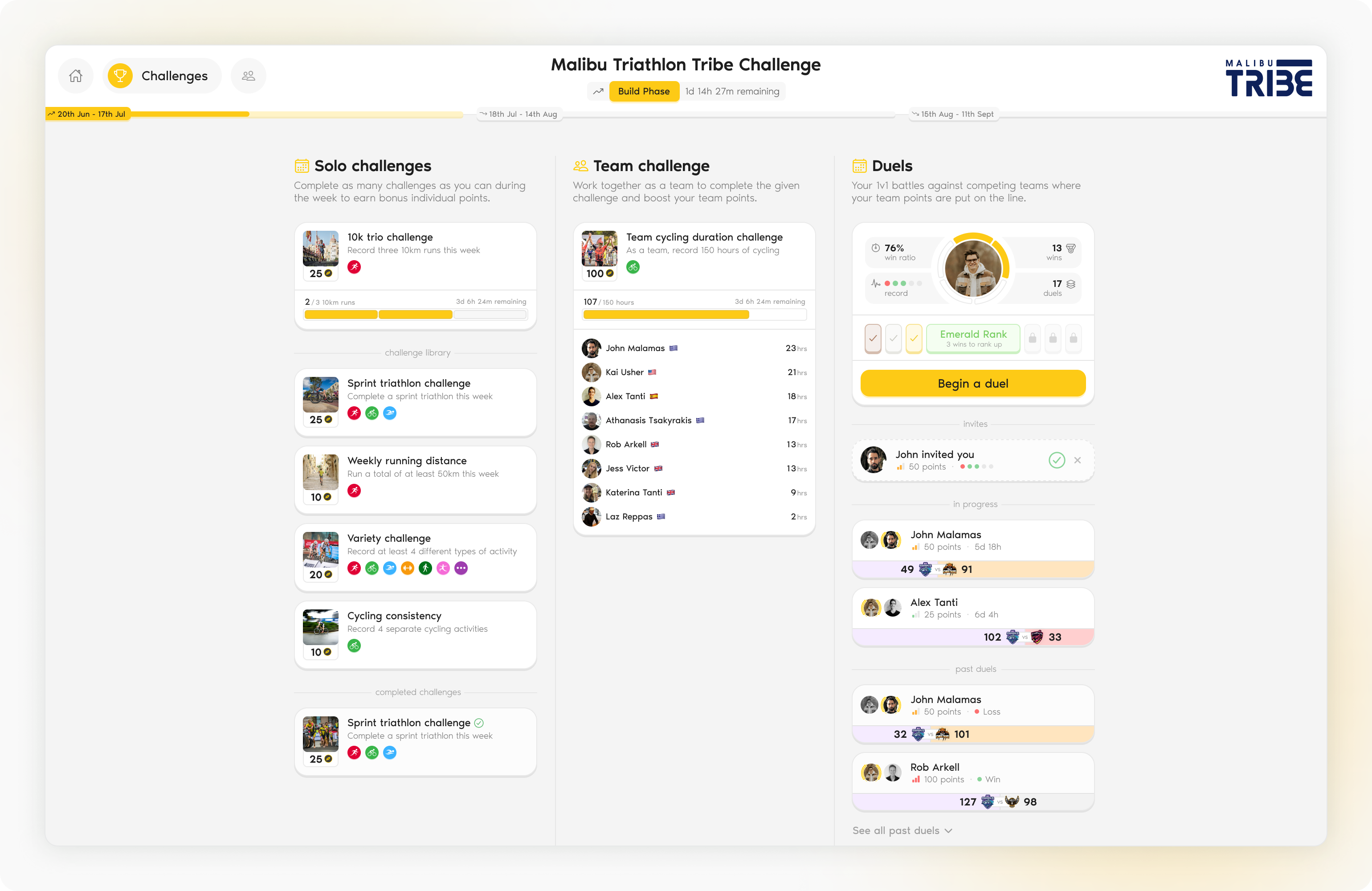
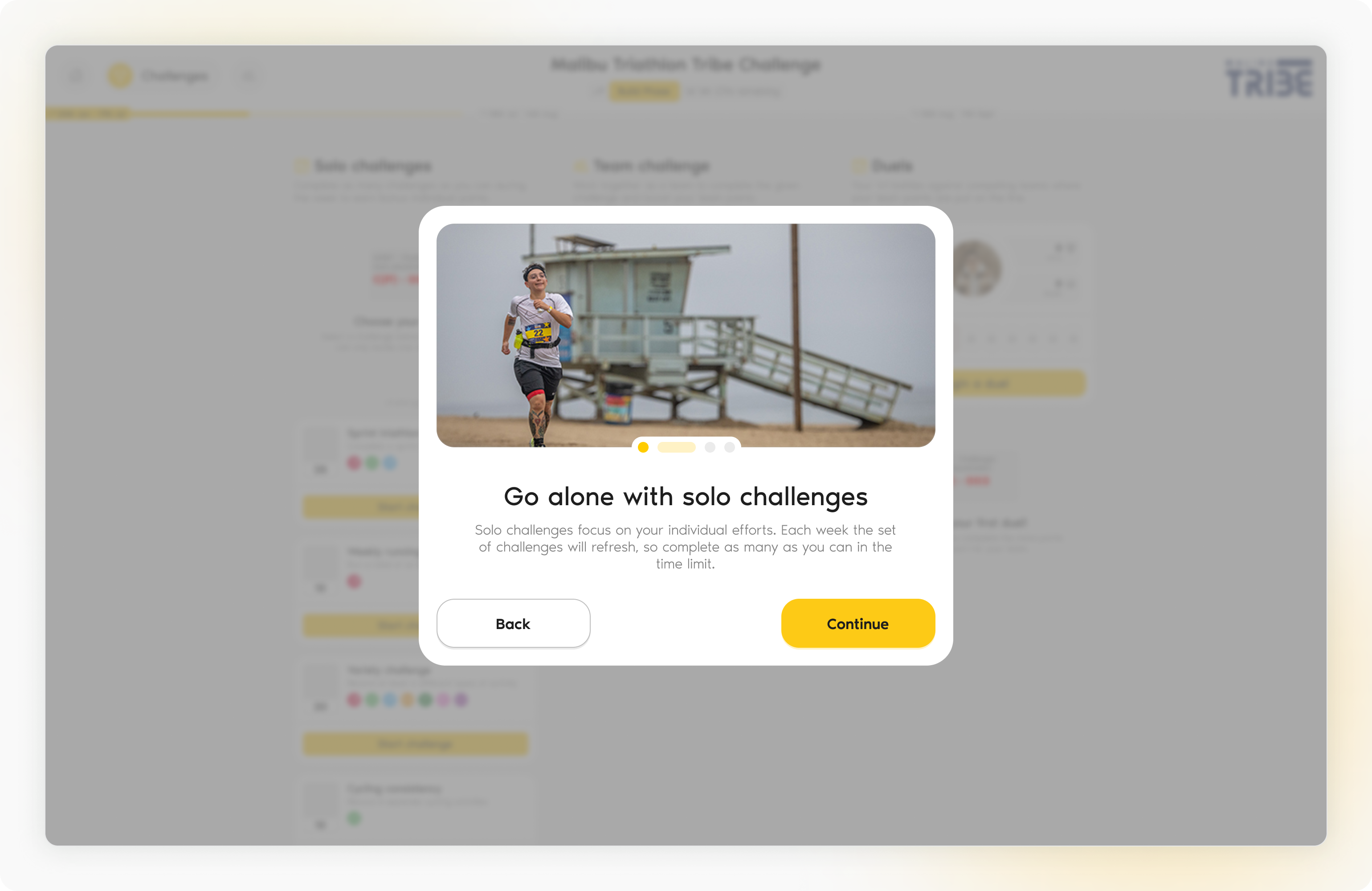
The new challenges page showcasing the three types of ongoing competitive challenges.
Duels would offer a way for competitive players to wager their points against a player from an opposing team. Whoever earnt the most points in the following 7 days would win the pot and push their duel ranking higher.
A duel could range from 'low risk' where no points were on the line and the competition was just for fun, to a 'high risk' duel where many points were being played for and could have significant impacts on the leaderboards for the round.
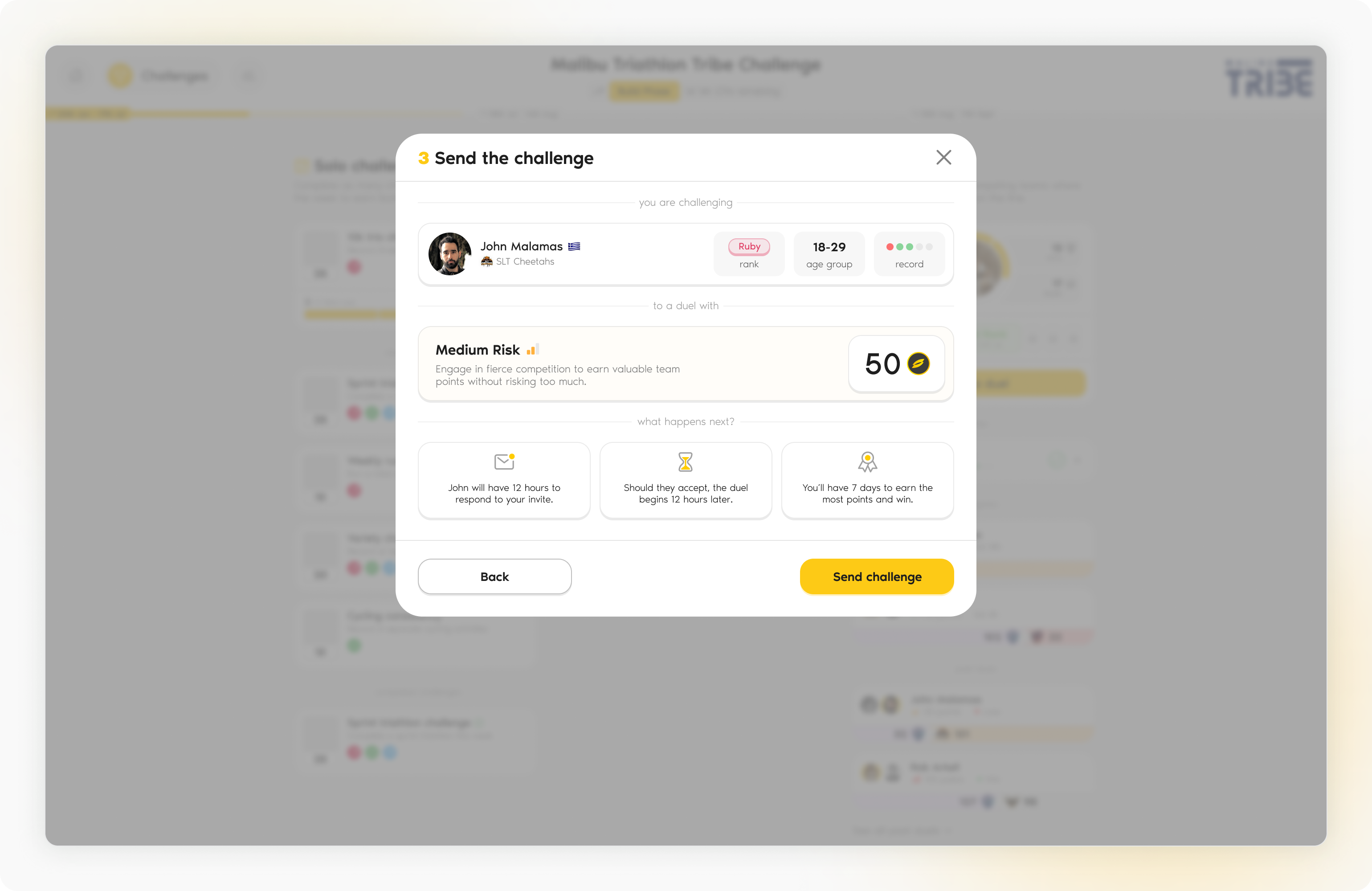
The confirmation step of the create duel flow showing who you are challenging, the type of duel and the next steps.
Below are some other notable designs from this release.
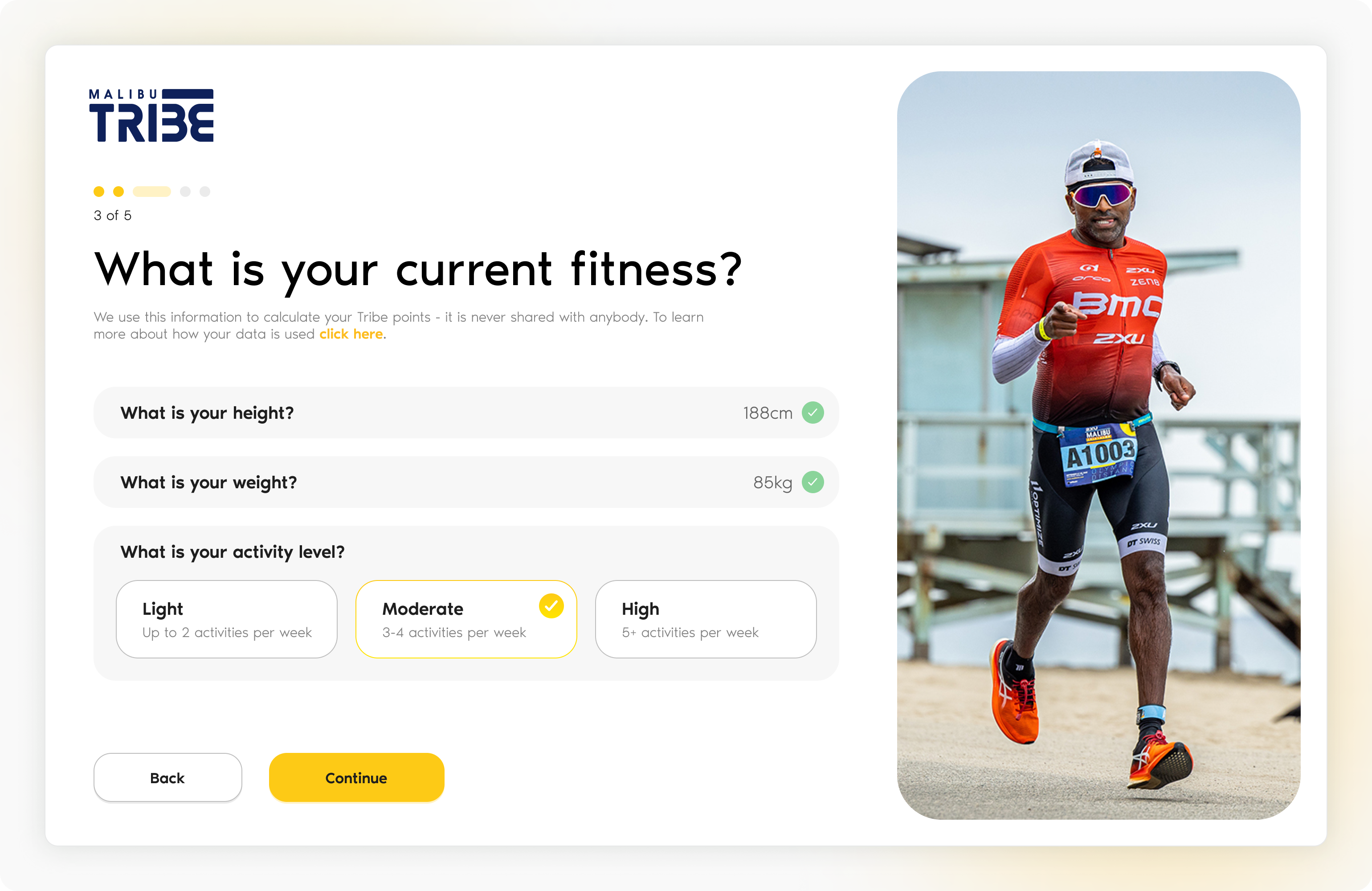
A reworked onboarding better guides users through getting their profiles set up and competing asap.
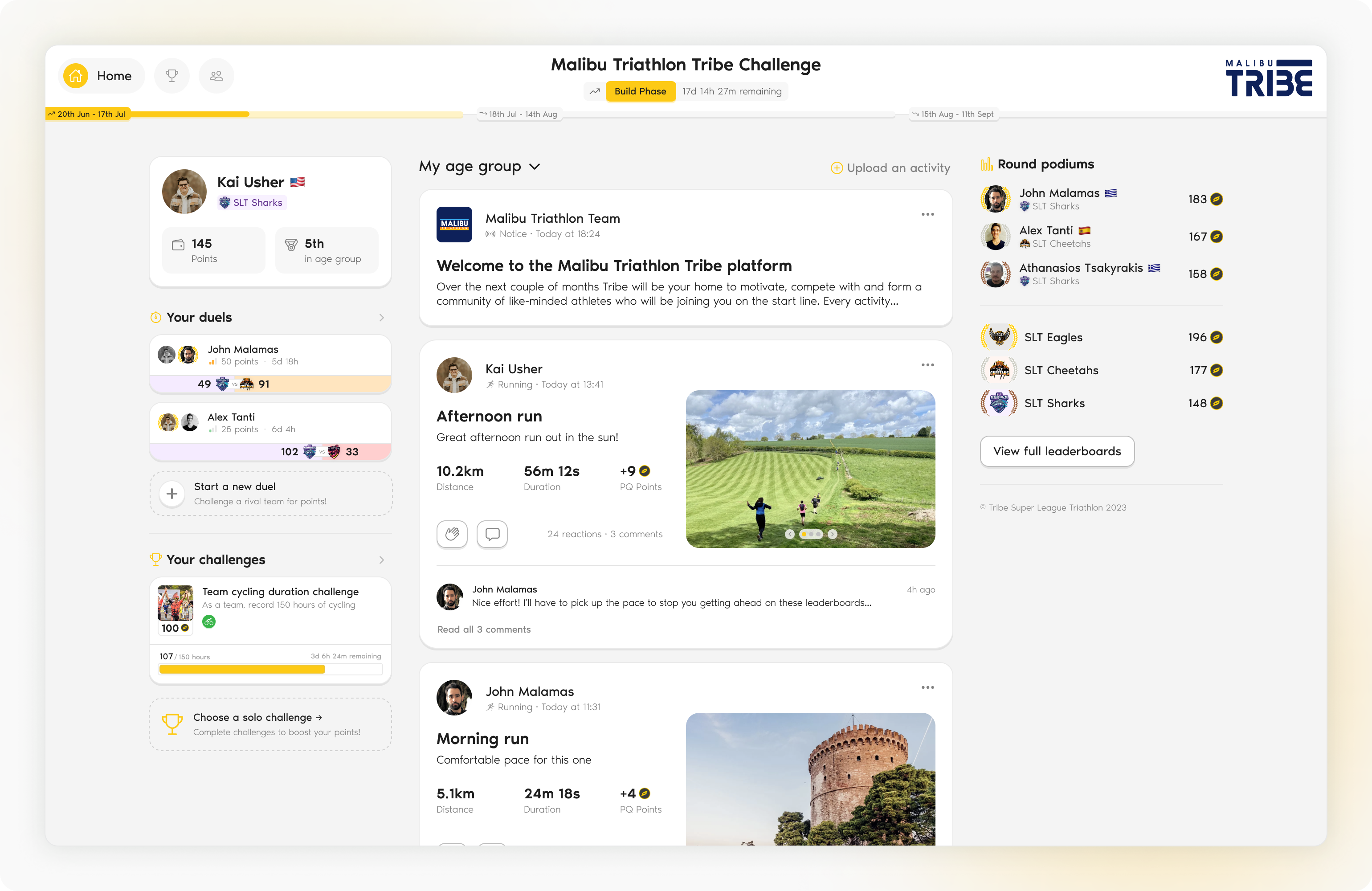
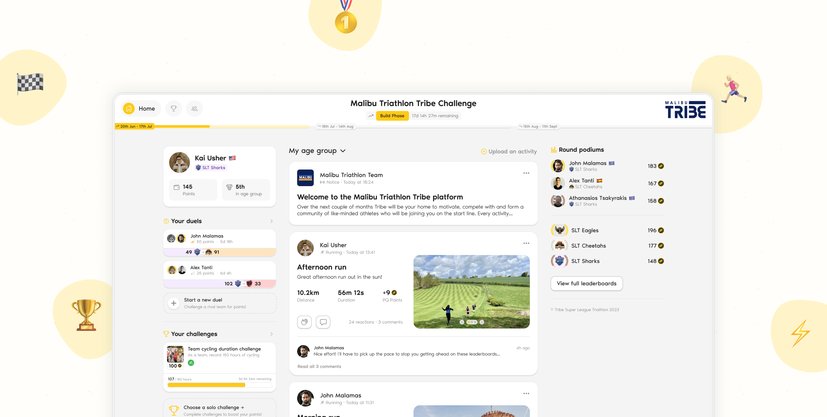
The new activity feed for Tribe. Sooo much better than the feeds above!
A new framework for tutorialisation was designed and implemented so when a user visits core-functionality for the first time they are introduced to it.
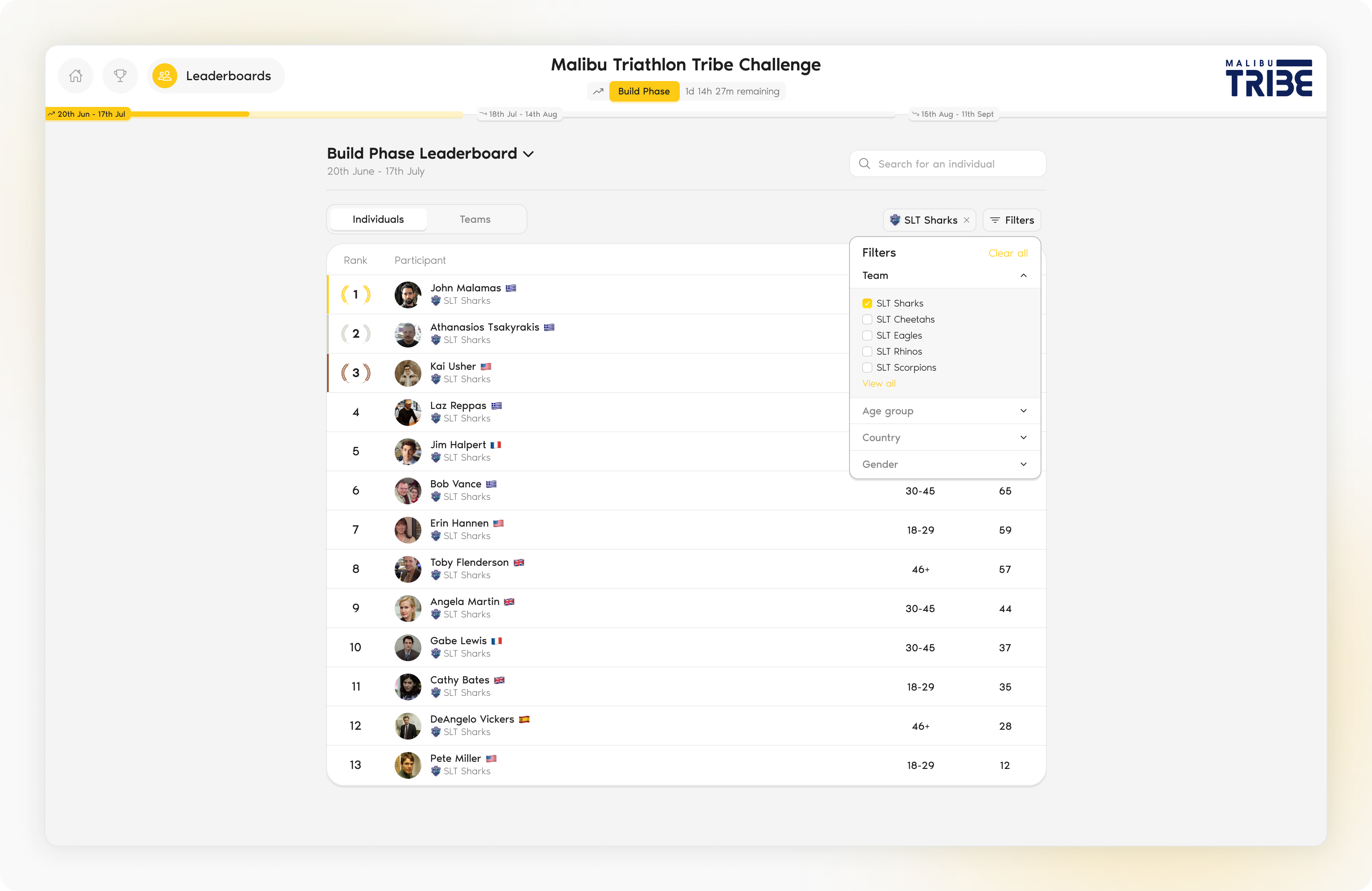
Tribe leaberboards are more information rich and support filtering so users can compete exactly how they wanted.
Reflection
Tribe was rolled out in 2023 and was very well received. Below are some highlights from a survey that was sent to users of the game with preceeded Malibu Triathlon 2023.
- Only 5.7% responders to the survey had a negative overall impression of the Tribe platform.
- The top three useful aspects were: 'Helped me stay motivated' (51.9%), 'Helped me stay consistent' (34.6%) and 'Helped my physically prepare/train for the event' (30.8%). All goals we set out to achieve!
- 76.9% of players would recommend Tribe to a fellow event participant.
- 61.5% either agreed or strongly agreed that the Tribe platform had a high level of usability.
52 players completed the online survey.
If I was to continue working on this project one thing I would like to do better/improve upon is the depth and variety of research carried out after the release. Whilst we received valuable feedback from post-game questionnaires sent to the participants, it would no doubt be amazing insight to have more open-ended conversations with our users to understand their pain points and/or favourite aspects of the platform.