Supreme.

Redesigning the Supreme
website following user research.

Initial research
A study was developed to explore the usability of the current Supreme website.

Study demographic

Research found that the Supreme target demographic is mostly 16-35 year old males, but due to the unisex nature of their clothing and the rise of female skate culture they are starting to attract a wider female audience. The study demographic reflects these statistics.

Scenarios

The scenarios were designed to replicate tasks which are likely to be commonly carried out by users on a the Supreme website, and therefore would give a more accurate insight into the usability of the website's core components.
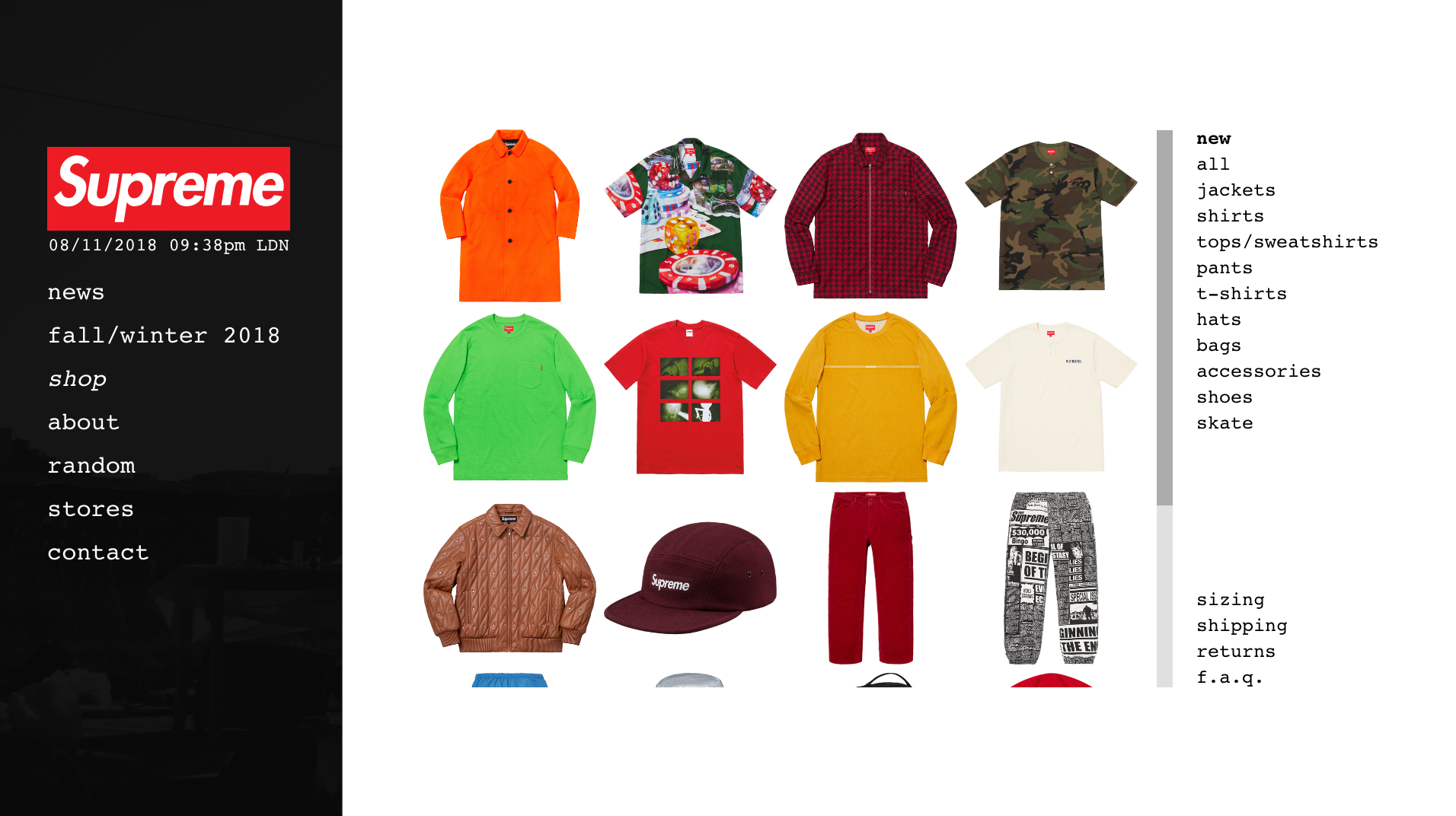
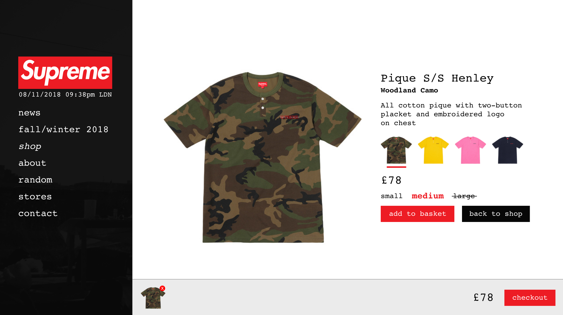
1

Following seeing a camo t-shirt you liked the look of being worn online you decide you'd like to buy one. Having loaded up the Supreme website you find the t-shirt in medium and add it to your basket.

2

The t-shirt has arrived, however unfortunately it’s the wrong size! Now you need to check out the returns policy to find out how many days you have to return the item to ensure you can get a refund.

3

As you’re going on vacation to Japan soon you decide to see if there is a store near where you're staying in Osaka so you can make a note of the opening times and view the location on Google Maps.

Results analysis
The data was compiled to discover the problematic aspects of the website.

Task 1

Task 1 was the task which had the highest completion time, averaged the most errors and also resulted in the most negative feedback from participants.

The main source of the problematic user experience was the page that users are greeted with when they navigate to the shop. The display, which appears to try and emulate a clothes rail, left participants not knowing how to find the item of clothing they were looking for and often resulted in confusion and semi-random clicking until progress was made.

"It just didn’t make sense, you couldn’t even see what you were selecting."

"I had no idea what item of clothing I was clicking on – I just clicked things until I found the item."

Task 2

The task of finding the returns policy was, on average, completed slightly faster than task 1 and with a slighty lower number of errors.

The main problem with this task can be narrowed down to the terminology and grouping used in regards to page titles. Combining this with the fact the required information is below-the-fold, participants found it difficult to locate the info they needed - this led to a couple of participants even leaving the correct page as they didn't think it was right.

"Went to terms first as I thought policies would be under there but it was actually under shipping information."

"I opened the correct page and then left as it didn’t seem right."

"I nearly gave up – I would normally have left the site and just Googled it."

Whilst analysing the path participants took to complete the task, it was discovered that there were multiple ways to get to the same information in different locations - this redundant information only led to further confusion.

Task 3

Task 3 was the most 'successful' task of all. The completion time for most participants was a fraction of that recorded in previous tasks, with the average being driven up by two outliers; these two outliers were also the only participants which made errors.

The reason the two participants struggled was due to the lack of a universal navigation. If they missed the link on the homepage there was no way to get to the information they needed, and thus got stuck navigating in a web of irrelevant pages.

The further comments show evidence of the above reasoning, but general sentiment was also much more positive than previously seen.

"The moment you leave the home page there is no shortcut to get to it. If you don’t see the tiny word on the home page you have no hope of finding it."

"This only took a few clicks to reach the required destination."

Redesign
A new website was designed and a functional prototype was built.

General improvements

Over 90% of people who took part in the initial study classed the readability of the text as ‘Very bad’ or ‘Bad’. This feedback resulted in me increasing the font size from the original very small size to a more readable size. Relative size comparison:

Original size

New size

On the existing website there is a large amount of wasted screen real-estate. I designed my new layout to utilise this white space whilst mainting a simplistic and uncluttered aesthetic - largely achieved by increasing the size of the images.

Redesigning the shopping experience

By far the biggest source of complaints about the existing Supreme website was the confusing layout of the shop; poor user experience was almost solely down to the unecessary and near-impossible to use view the user is initially presented with (as seen below).

As this page provides no value I chose to completely remove it from my redesign so the user is immediately presented with a more standarised shop view.

The secondary navigation has been reworked so it is clearer what section the required information will be in. This means information is more spread out and there is a much higher chance the desired information is above-the-fold and easy to find.

The final significant change to the shopping experience is the redesign of the basket.

When at least one item is in the basket it will be visible at the bottom of the screen, shown as a full picture. Items can be removed with a single click, without having to navigate into a more detailed ‘view basket’ page, and the total cost is clearly displayed alongside a button to quickly checkout.

The basket is a persistent element on the screen regardless of where the user is on the site. Overall, this design choice streamlines the shopping experience and helps achieve the ultimate goal of the website - buying clothes.

Redesign study
The study was carried out again to determine the success of the redesign.

The same study (with the same scenarios) was carried out again, however this time the redesigned prototype was given to a new group of participants. The participant demographic closely matched the initial study, and therefore the Supreme target audience.

Results analysis
The results were compiled and compared against the original study.

Task results

Overall, the redesign was proven by the results of the retest to be a great improvement of the user experience of the Supreme website.

With an average time of 9s and zero errors, Task 1 saw a drastic improvement from the original evaluation. Every participant completed this task in 3 clicks which shows good consistency.

Task 2 had an average time of 14s, an average of 2.1 errors, and on average took 3.8 clicks. This task can be defined as the one which has the most room for improvement still.

Task 3 was the task with the best result in the original evaluation, but still saw significant improvement. On average it took 7s, had zero errors and required 2.1 clicks.

On average, all three tasks were completed 9.2x faster than in the original study.

Scale results

Each scenario/task had a question related to how difficult the participant found it to complete. Comparing the results from the retest (bottom scales) with the original evaluation (top scales) clearly shows that the redesign improved the user experience.

How difficult was it to find the camo t-shirt?

How difficult was it to find the returns policy?

How difficult was it to find the details of the Osaka store?

The shift from a majority red to a majority green demonstrates that completing a range of common tasks has shifted from being difficult to easy thanks to the redesign.

Where 1 is ‘very bad’ and 5 is ‘very good’, how would you describe your overall experience with the Supreme website?

User comments

There was a significant reduction in the amount of ‘additional comments’, which can been seen as a great improvement from the vast amount of negative comments from the original evaluation.

By tallying up the sentiment of comments on both the original evaluation and redesign questionnaires it is clear how opinions changed. Only 27% of comments on the original evaluation were positive, which is a big contrast to the 73% of positive comments on the redesign.

"Very simple because everything is so concise."

"Easy to use and easy to locate the wanted item of clothing."

"Standard online shopping experience."

Reflection
There are a number of changes I'd like to make to this project.

Due to the fact this project was a university assignment there were a few limitations which sculpted the way the studies were carried out.

Participant demographic limitations

The number of participants we had to recruit was set in the specification and therefore only 12 people completed the first study, and 7 people completed the second study. Whilst the data collected is still perfectly valid and accurate, this is by far the most notable area for improvement. If I were to conduct this study again I'd use a much larger sample size to get more representative results.

Furthermore, the demographic could be tailored better to match the target audience of Supreme. A large proportion of the participants stated they had at least a small interest in online clothes shopping from niche brands, however nobody classed themselves as a stereotypical Supreme fan.

A/B testing

If I had more time and flexibility to carry out the study I would have liked to perform some form of A/B testing to compare how well different redesigns and/or design principles solved the problems from the initial evaluation.

Conclusion

In conclusion, I would class the redesign and retest an overall resounding success, however the execution of the study could be improved by making changes to the study demographic.

To view the complete write up and print design (PDF) for this project click here.